
A performance running identity built for movement, community and impact.
CAMPAIGN | BRAND IDENTITY | 2026
The ChallengeCreate an identity for a runners themed fashion brand. Capture movement, community and self-expression across apparel, digital and environmental applications.
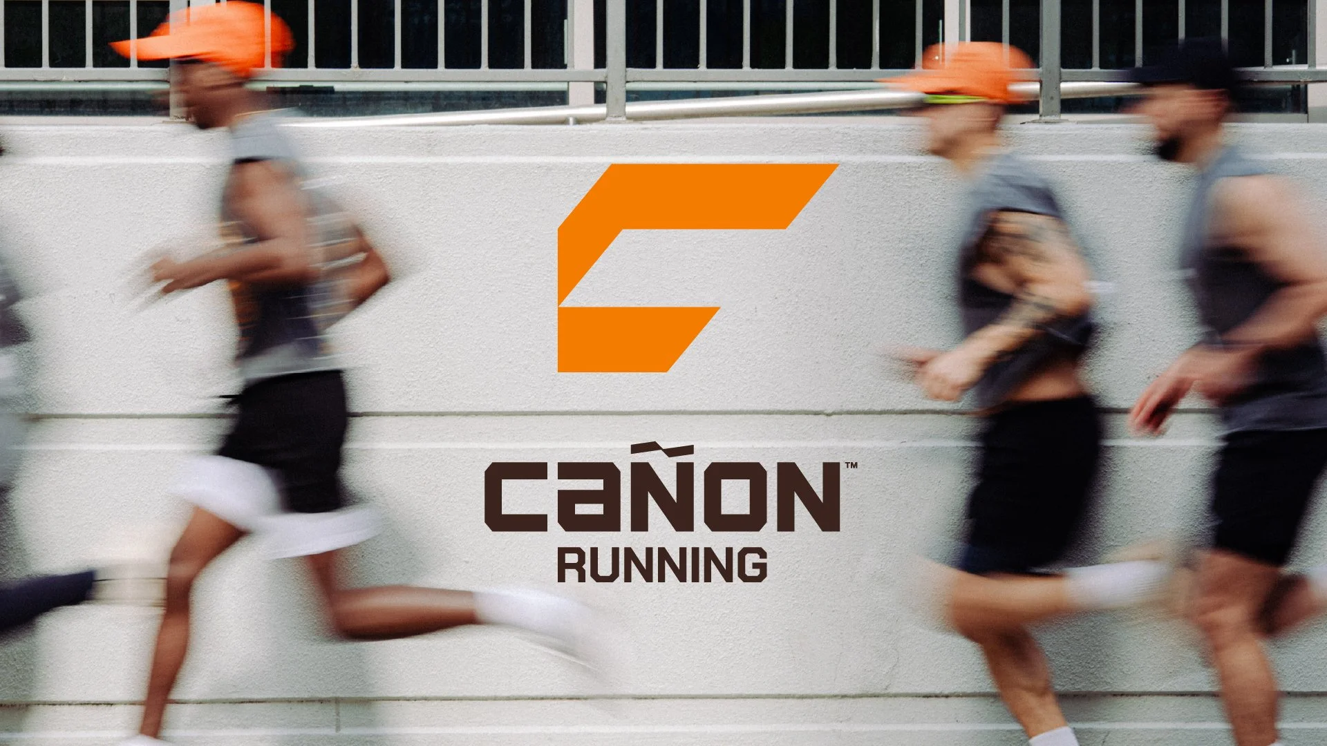

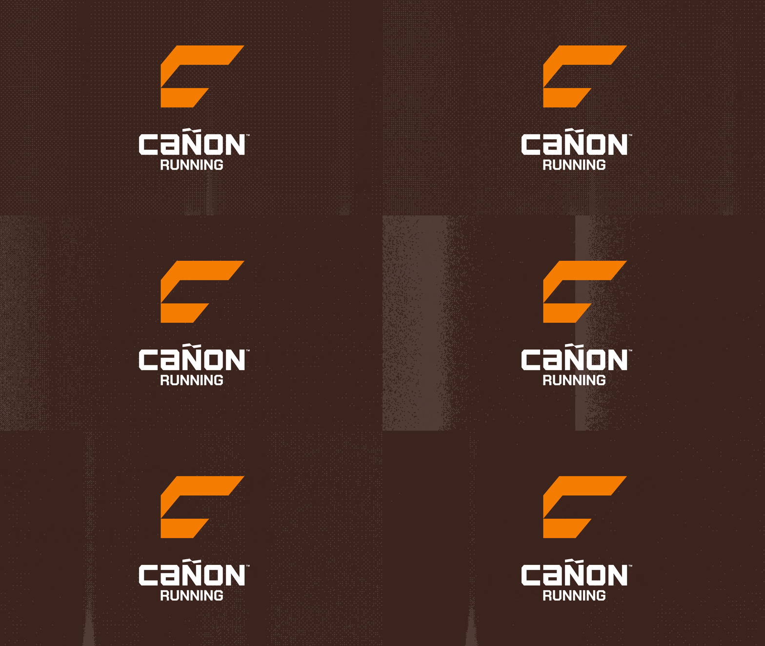
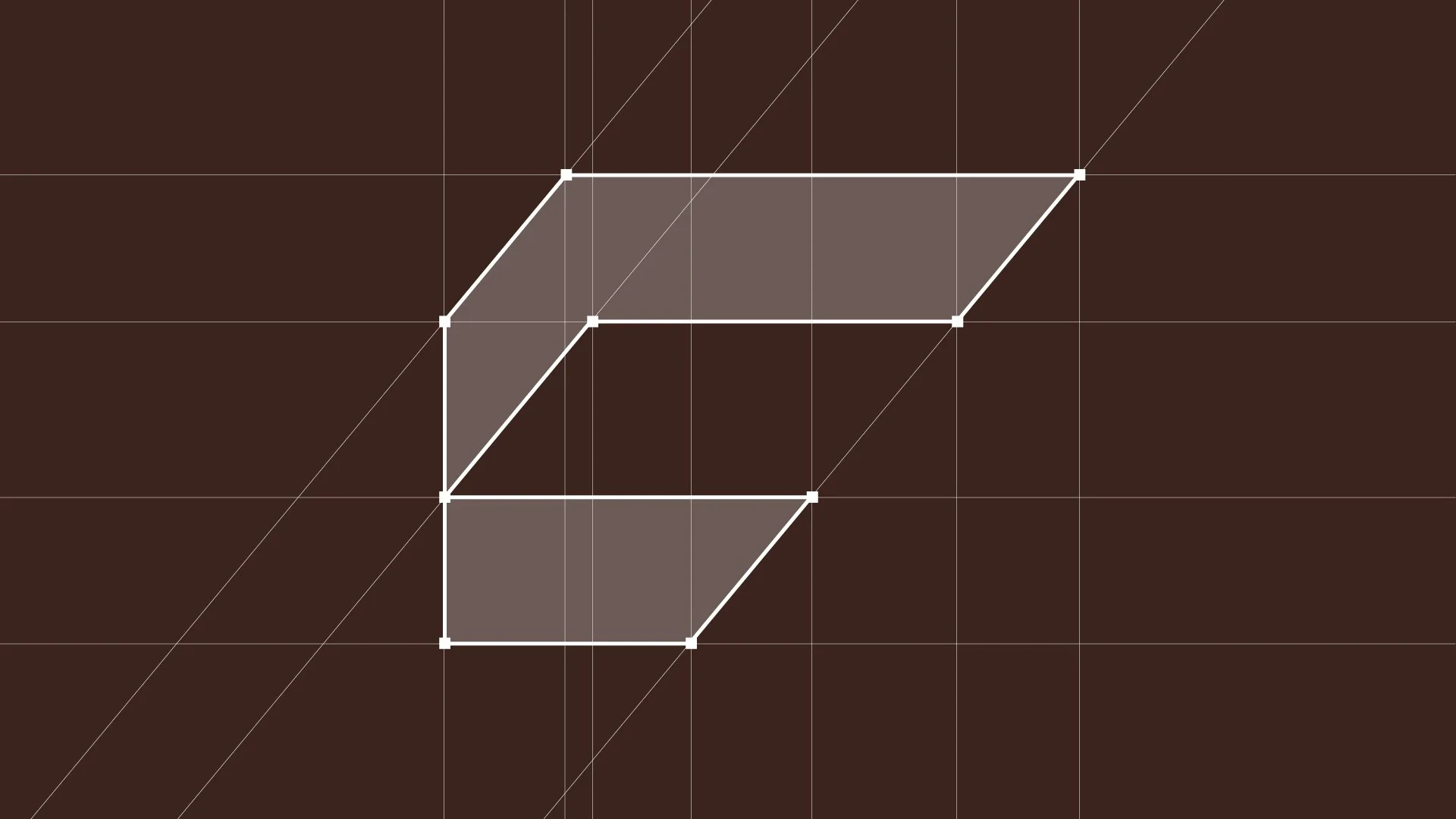
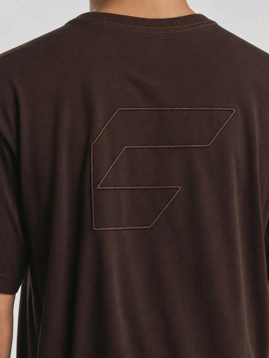
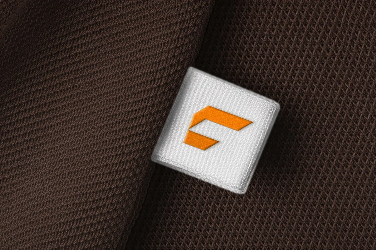
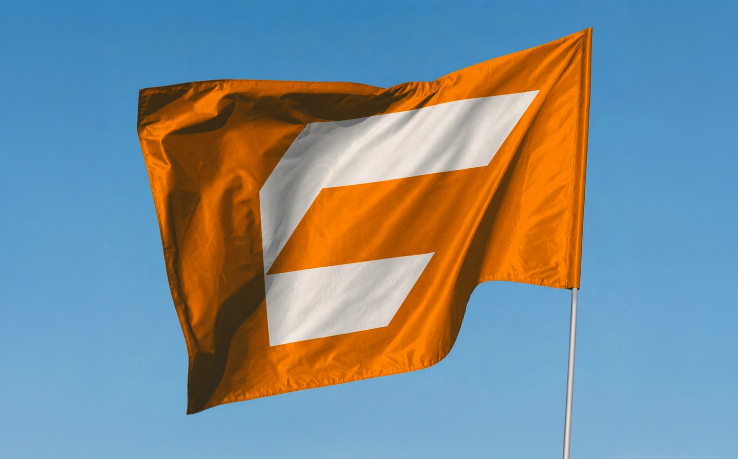
LogoThe logo began as a hand-drawn C that was refined into a bold geometric mark. Angular forms and negative space create a sense of speed and forward motion while keeping the symbol simple and recognizable.

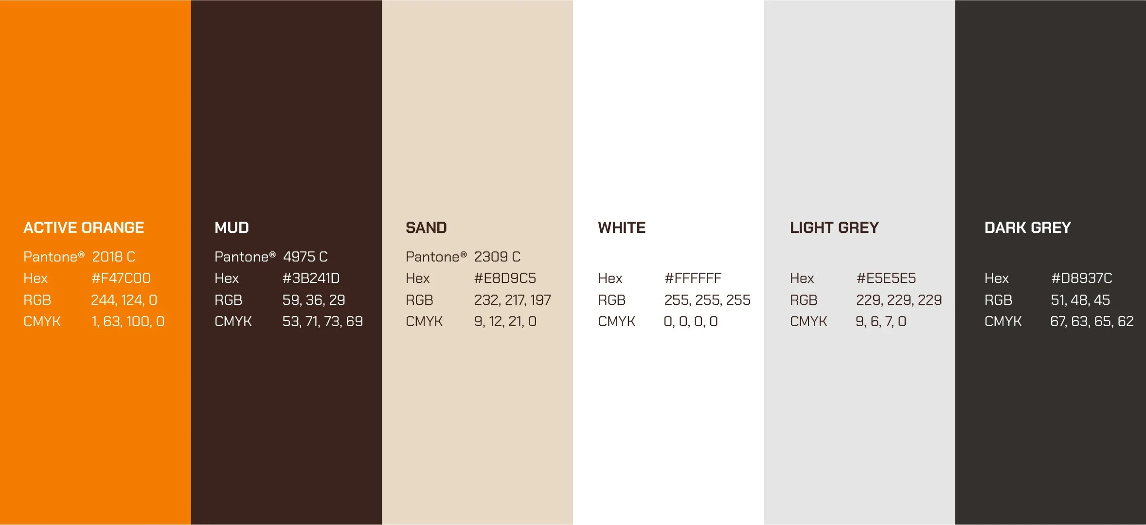
Color SystemActive Orange brings energy and visibility to the identity, while Mud and Sand introduce warmer, earth-inspired tones.
TypographyChakra Petch reinforces the angular geometry of the identity with a technical, athletic character. Funnel Sans provides a cleaner supporting typeface, creating contrast and clear hierarchy across communications.

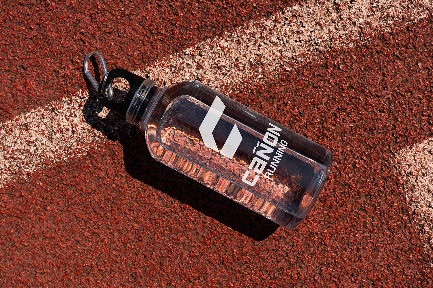
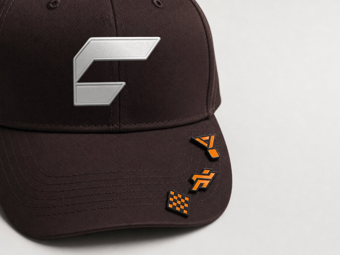
ApplicationThe identity was designed to adapt across apparel, tags, bottles, headwear and event materials. Varying the scale and placement of the logo creates consistency without making every application feel repetitive.
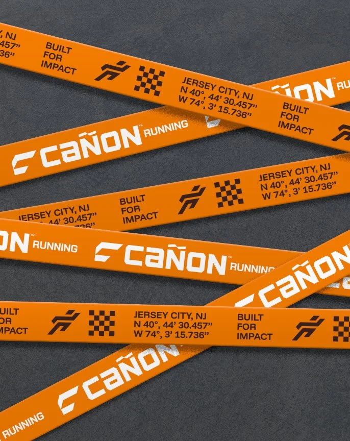

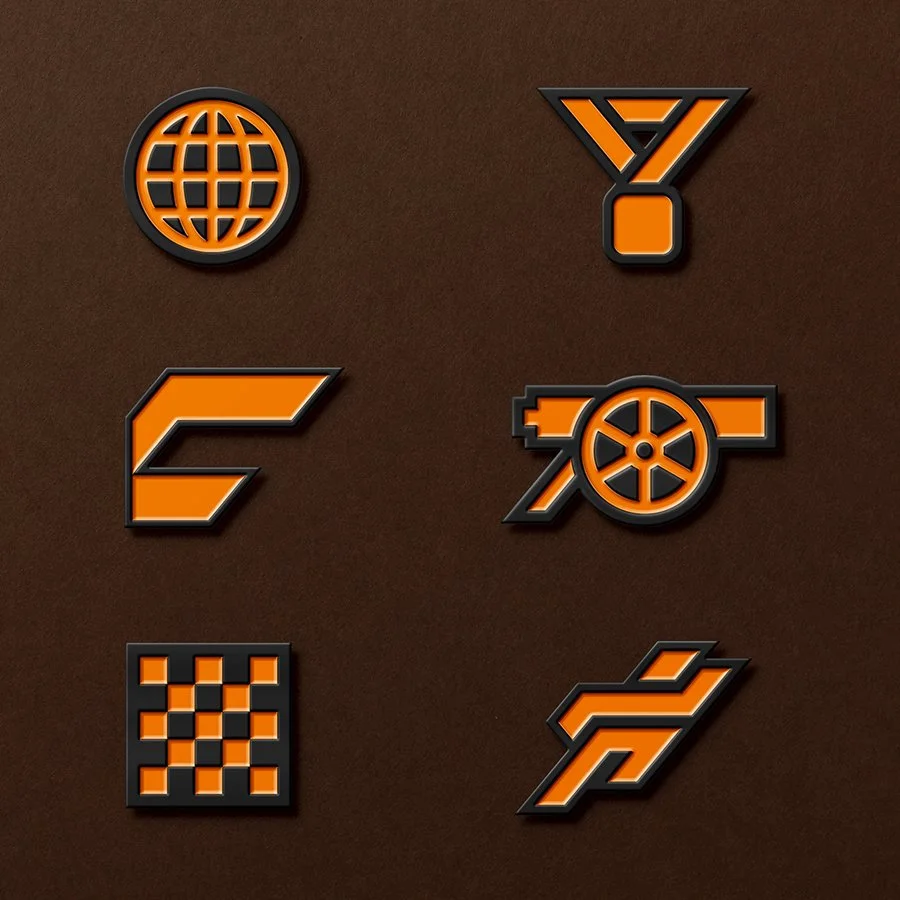
IconographyThe icon system extends the brand through symbols inspired by movement, achievement and community. Each icon shares the same geometric language as the primary mark, allowing them to function as badges, graphics and secondary brand elements.
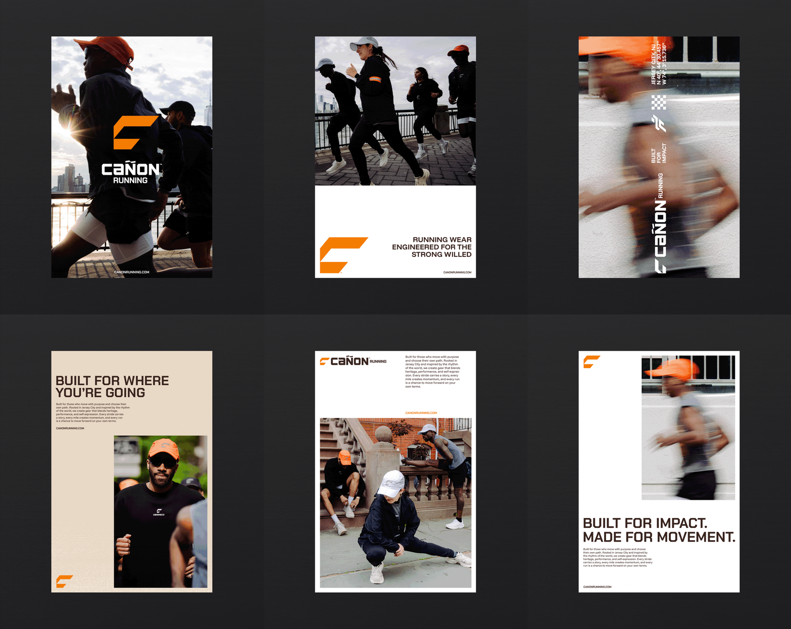
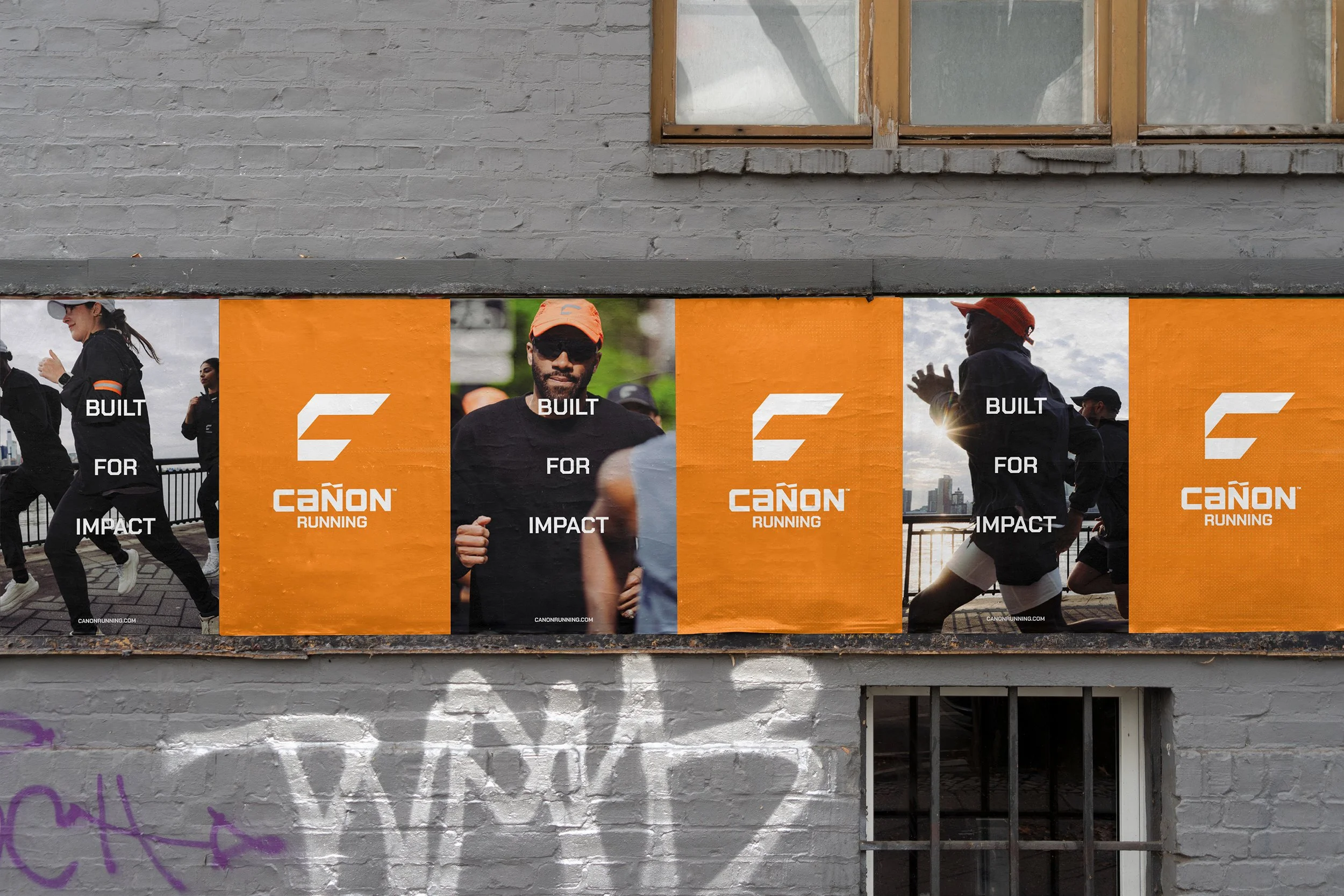
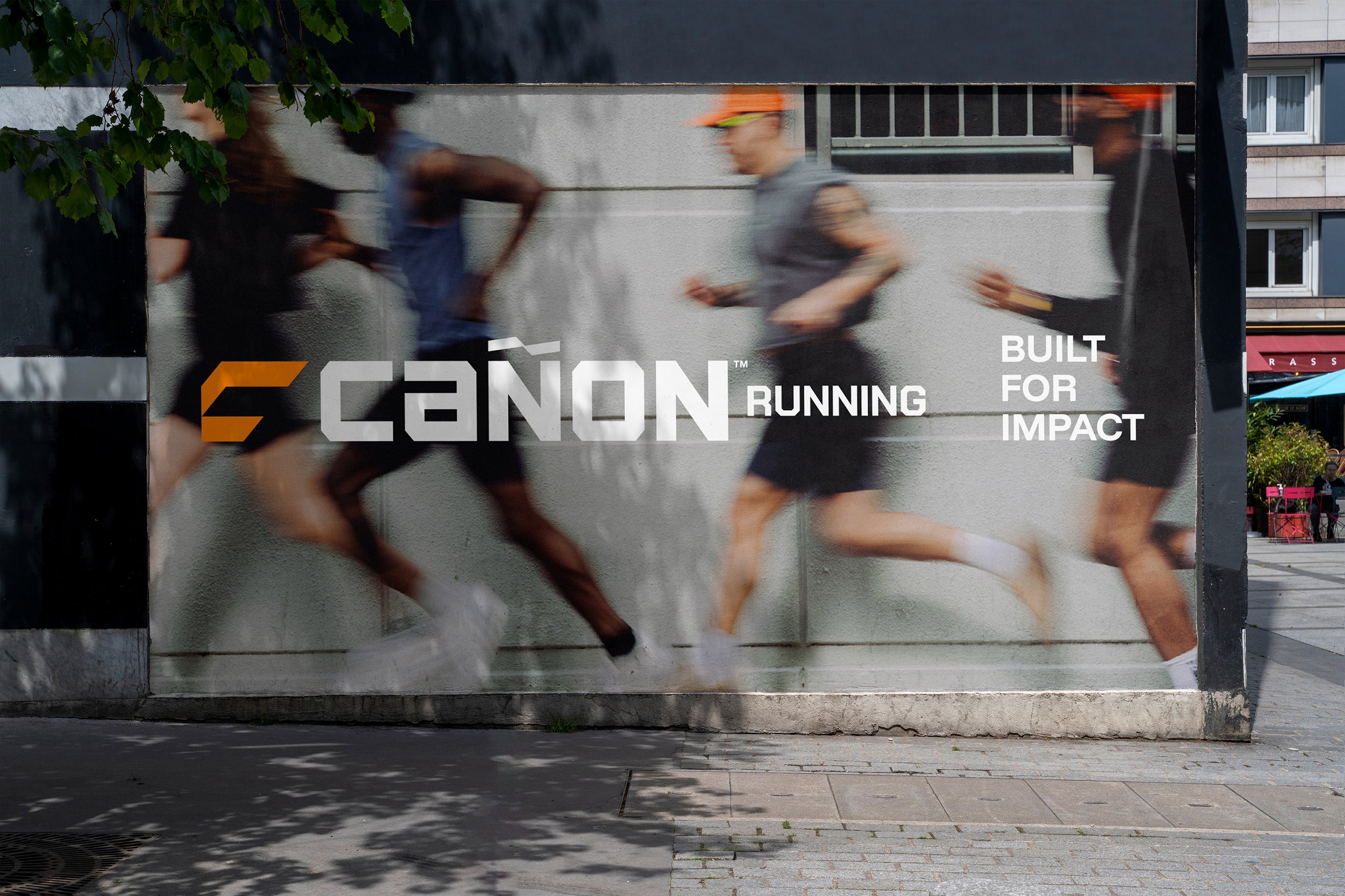
OOHThe OOH system combines motion-driven photography, bold branding and minimal messaging. Large-scale graphics and Active Orange create immediate recognition, while blurred running imagery reinforces speed and movement.
OutcomeThe result is a flexible visual system that gives Cañon Running a distinct presence across performance, lifestyle and community touchpoints. Every element works together to create a consistent identity rooted in movement and impact.
Credits